
Getting Startet with Pivot
In this post we give a short introduction into the new Pivot capabilities of ReportServer’s dynamic list which we added with ReportServer 2.2.
 With ReportServer 2.2 the dynamic list got a powerful new feature: a dynamic list can be transformed into a Pivot table. This gives completely new possibilities for ad-hoc reporting and adds the capability of easily generating beautiful charts, which can then, for example, be pushed to the dashboard. In this blog post I will walk you through the generation of a simple Pivot table and accompanying chart. We want to emphasize that we use the fantastic open source project Saiku which we also included in ReportServer for the use with OLAP (Mondrian) reports. Thanks for the great work team Saiku.
Pivot mode of Dynamic Lists
For this tutorial we are using the ReportServer demo data and the predefined report T_AGG_CUSTOMER containing customer information of an imaginary toy manufacturer. Our goal is to create a report that gives an overview of the volume of sales generated by the company’s employees grouped by office, city and country. If you have the demo data installed, you will find the report in the administration module in the folder “dynamic lists”. If you do not have the demo data installed, the report can easily be created by hand. Simply create a dynamic list with the demo data source as datasource and use the following query:
SELECT * FROM T_AGG_CUSTOMER
For more information on how to install the demo data have a look here or at the configuration guide.
Next, we are going to generate the report step by step. After opening the empty dynamic list, the first step is to activate the Pivot mode. For this, use the Pivot button from the toolbar.
 to confirm the switch to the Pivot mode which should trigger a change in presentation. You should still see the tabs computed columns and prefilter but now have the additional tabs dimensions/measures and pivot/preview. Before you can use the Pivot functionality you need to specify which of the attributes you want to use as dimensions and which attributes you want to use as measures. For this, click on “Select dimension/measures” from the toolbar in the dimensions/measures tab and select the attributes
- OFF_COUNTRY
- OFF_CITY
- EMP_LASTNAME
- VOLUME
The underlying table contains one row for each customer and in particular contains information on the volume of the customer. That is, we have information on the volume of sales generated by that customer, wich employee is assigned to the customer and the employee’s office location (city and country). We will use the attributes OFF_COUNTRY, OFF_CITY and EMP_LASTNAME as a combined dimension. For this we assign all three attributes the same dimension which we call Employee. The attribute VOLUME is used as a measure and we assign the aggregator “Sum” as we want to display the summed volume of sales an employee is responsible for.
 Having defined dimensions and measures we can switch to the Pivot/Preview tab. Note that, if you make changes to dimensions or measures, you need to reload the Pivot view. For this you can use the green circled arrow from the Pivot view toolbar.
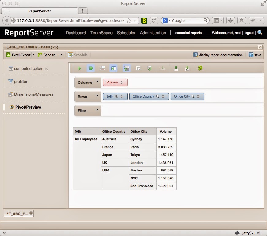
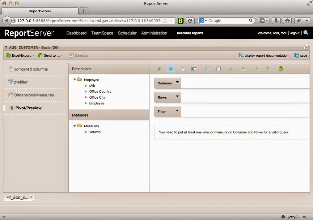 The pivot view is structured into three parts. On the left you have your dimensions and measures and on the right is the display area. We want to display employees by their generated volume of sales. For this we drag the All part from the Employee’s dimension on the rows field and the single measure Volume on the Columns field. The view should update to show you a single value: The total volume of sales by all employees.
 You can now drill down to display more information. For this, click on “All Employees” and, for example, select Show Children from the context menu. This results in one extra level of detail, that is, the volume is now grouped by country. In the following screenshot I have drilled down to the level of employees within the Paris office but kept to a level of City for all other offices.
 This report can now be exported to, for example, Excel or PDF or saved as variant and scheduled similarly to any other report within ReportServer.
Creating Charts


 All that remains is to configure the dadget to point to the just created report variant, in my case “Volume_by_Country” and select a chart type as presentation type.
 |
 |
Voilà